Color Analysis Report Example
A real color analysis report example: exact type, 36-color palette with codes, colors to avoid, makeup, hair and jewelry guide, and a color card.
Loading the example report…
Get your own report
Your season and key colors are free; the full report is a one-time purchase.
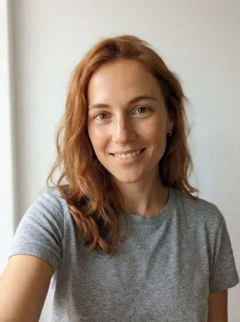
Analyze my photo free- Sample photo
- An AI-generated model, not a real person
- Result
- Warm Autumn (also called True Autumn)
- Next closest type
- Warm Spring
- Confidence shown
- 0.9 out of 1
- Colors read from the photo
- Skin #D8A381, hair #B15E39, eyes #706346
- Palette size
- 36 colors in 4 groups
- Price of a full report
- $4.99 one-time, or $9.99 for three
- Report generated
- 2026-10-24
- Why it fits (from the report)
- Coppery hair, warm hazel eyes and golden-peach skin all share the same golden warmth; nothing in the coloring is icy or stark
- Colors to avoid near the face
- Black, Pure White, Icy Pink, Cool Fuchsia, Royal Blue, Lavender, Blue Grey, Silver Grey
- Lipstick shades
- Warm Nude, Terracotta, Rust Red, Brick
- Blush shades
- Apricot, Peach Bronze, Soft Terracotta
- Eyeshadow shades
- Bronze, Copper, Olive, Forest
- Hair colors
- Copper, auburn, golden brown and warm chestnut. Avoid ash and blue-black.
- Best metals and stones
- Yellow gold, copper, bronze and brass; amber, tiger's eye, carnelian and turquoise.
- Best white
- Cream
- Instead of black
- Chocolate brown, olive or coffee instead of black
| Color | Color code | Group |
|---|---|---|
| Cream | #F2E3C6 | Neutrals |
| Camel | #C19A6B | Neutrals |
| Khaki | #9F8F5E | Neutrals |
| Warm Taupe | #8B7355 | Neutrals |
| Bronze | #8C6239 | Neutrals |
| Olive Brown | #645A3A | Neutrals |
| Coffee | #6F4E37 | Neutrals |
| Chocolate | #5A3825 | Neutrals |
| Warm Charcoal | #4A4238 | Neutrals |
| Salmon | #E9876A | Pinks, reds & purples |
| Burnt Coral | #E2694E | Pinks, reds & purples |
| Tomato | #D1442A | Pinks, reds & purples |
| Terracotta | #C4653F | Pinks, reds & purples |
| Paprika | #B2402A | Pinks, reds & purples |
| Rust | #B7410E | Pinks, reds & purples |
| Brick Red | #A4342A | Pinks, reds & purples |
| Mahogany | #7C2F21 | Pinks, reds & purples |
| Warm Aubergine | #5E3448 | Pinks, reds & purples |
| Khaki Green | #8A8B4E | Blues & greens |
| Avocado | #82852F | Blues & greens |
| Olive | #7A7A35 | Blues & greens |
| Moss | #6E7B33 | Blues & greens |
| Forest Green | #3E6B36 | Blues & greens |
| Jade | #3E8E6E | Blues & greens |
| Deep Turquoise | #1F7F7A | Blues & greens |
| Teal | #2F6F6B | Blues & greens |
| Petrol | #2C5E68 | Blues & greens |
| Saffron | #E9A12B | Yellows, oranges & extras |
| Mustard | #D4A12B | Yellows, oranges & extras |
| Gold | #CF9F2F | Yellows, oranges & extras |
| Butterscotch | #DBA046 | Yellows, oranges & extras |
| Amber | #C98A1E | Yellows, oranges & extras |
| Apricot | #E79A5E | Yellows, oranges & extras |
| Pumpkin | #D2691E | Yellows, oranges & extras |
| Burnt Orange | #CC5500 | Yellows, oranges & extras |
| Copper | #B76E3D | Yellows, oranges & extras |
This is a complete color analysis report, exactly as a buyer sees it, made from a sample selfie of an AI-generated model with copper hair and warm hazel eyes. Scroll through it to see what the full report adds to the free result: the exact type out of the 12, the reasons it fits, the next closest type, a 36-color palette with names and color codes, the colors to avoid, makeup shades, hair colors, the best metals, an outfit color checker and a downloadable color card.
What the free result shows, and what the full report adds
The free result tells you your season family (here: Autumn), its four key colors and lets you drape them under your face, so you can see the difference before paying anything. The full report goes one level deeper. It names the exact type within the season (here: Warm Autumn rather than Soft or Deep Autumn), explains which features in the photo led there, and turns that into a practical shopping list: neutrals to build a wardrobe on, accent colors, colors to keep away from your face, and makeup and jewelry that follow the same logic.
How to read a color analysis report
- Your type and traits. Undertone, depth, chroma and contrast are the four traits color analysts look at. The leading trait decides the type.
- The palette. Wear these near your face: tops, scarves, collars, glasses frames. Colors in the same palette combine easily with each other.
- Colors to avoid. You can still wear them below the waist or in shoes and bags.
- Your white and your black. Most people look better in one particular white and in a dark neutral that is not pure black.
- The outfit checker. Photograph a garment in daylight and tap the fabric to compare it with your palette. The photo stays on your device.
In this example, the leading trait is warmth, so the type is Warm Autumn; the report suggests chocolate brown, olive or coffee instead of black, cream instead of optical white, and terracotta or rust lipstick rather than blue-based pinks.
Get your own color analysis report
Start with a free photo analysis or the color analysis quiz. If you like what the free result shows, unlock the full report for $4.99 one-time. See pricing for the details and the Warm Autumn type explained for more about this example's palette.
Frequently asked questions
Is this a real person?
No. The sample photo shows an AI-generated model, so we can show a full report without using anyone's face.
Does my report look the same?
Yes, with your own type, the colors read from your photo and your own explanation. If you used the quiz instead of a photo, the observed colors section is left out.
Can I download or print my report?
Yes. Every report has a print button and a downloadable color card image for shopping.